Realtor.com Listing Detail Page (LDP)
Realtor.com | 2018 - 2019 | Mobile App Design, Android, iOS
Overview
The Listing Detail Page ( LDP ) is one of the most important sections in Realtor.com ( RDC ) ’s mobile app; it hosts the detail information of a For Sale Home. Usually, it is the destination where user accomplishes his/her goals of using the app.
I have been heavily involved in the design of LDP. It has been constantly improved through a designing - testing - redesigning process. Here I am showing a few design samples that have significant contributions to the success of the product.
LDP had a major “Design Refresh” in 2018, which helped our Android app’s Consumer Satisfaction Score (CSAT) reach 85, an all-time-high score; soon following that, our app was awarded as Gold Stevie® Winner App in real estate.
In 2019, the LDP had another minor “Design Uplift”, which contributed to double digits increases in most engagement and conversion metrics.
I was responsible for the design of the apps on both Android and iOS.
Home-Shoppers
While we also provide service for different groups of people in real estate, including agents, home owners and tenants etc, the major user of this project is Home Shoppers, either first time buyer or repeat buyer, and no matter what stage they are in the journey of home buying.
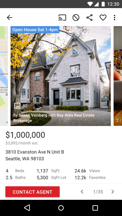
The Previous design

Above the Fold was almost broken
Visually, the information is not easy to scan.
Open House schedule is important, but not all listings have it available.
Property facts are not enough for user to make any decision, he/she needs to scroll down for more information.
The full Listing Detail Page has other issues (Won’t be elaborated in this article)
Difficult to find specific information section
Inconsistent design patterns
Arguably long
Goal
Helpful, enjoyable to use, better engagement & conversion
Surface key information for easier scan
Better information hierarchy for easier search
Visually appealing, enjoyable to look at
Help user make better judgement on the listing
Further assist if user decides to continue or not
If we can’t help enough, further assist user with connecting professionals
Work with researcher
We had been collecting users’ feedback on a daily basis. While I have general idea of what information user is looking for, researchers set up sessions to find out more details, such as the priority order of the listing information that helps user make a decision to continue (or not) on the listing.
Explorations
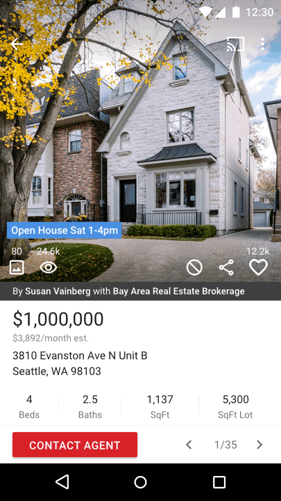
I want to use the hero image area to help user get most of what they want.
People generally love to see photos; and when it comes to real estate, a photo of a home can significantly influence home shopper’s judgement. Inevitably, user spent most time here.
Square photo is trendy, it’s enjoyable to look at. It is big enough to show the gist of the photo; and small enough to provide affordance to swipe for more
Open House as a label, only shows up at the top when it’s available
Simplified key facts for lessen the distraction
Adding social data to help user’s judgement on the pricing and the chance of getting the home
Bringing the map to the top so user doesn’t need to leave the photo area; easier to connect with the neighborhood
So, why not try even bigger?
Bigger photo is always more delightful for the home shoppers who spend time on it.
Putting information and action buttons on the hero image is more forgivable when it’s big enough
More forgivable when it won’t be there from the second photo
Key facts can be kept in a easily scannable format
“Design Refresh” Outcome
Although I have done many explorations (not only Above the Fold, but also other sections on LDP), at the end of the project, for practical reasons, we didn’t fully implement all the design changes we wanted to make.
We did extensive research on the priority order of the information that user wants; eventually we surfaced extra six key facts.
The new Above the Fold design itself contributed to metrics exceeding our business goals and gained double digits increases on both engagement and lead conversions.

More examples of the LDP design refresh
All these improved features are highly appreciated by our user. We believe they, plus the new Above the Fold, contributed significantly to our all-time-high CSAT (Consumer Satisfaction Score) at 85.
“Design Uplift” and Outcome
In 2019, I have been doing a “Design Uplift” to both Android and iOS apps. The main goal of it is to keep the design consistent across platforms, so that our brand speaks only one tone, and user have lower learning curve when they jump between platforms (especially web and mobiles). With this uplift, we have seen user engagement become even higher and more first time user converted to repeat user (+15% lift in “save” a listing).
