TeamworkIQ
A virtual assistant who coordinates teamwork, tasks and processes for managers in small medium businesses
2015-2016 @ Hakman Labs | SaaS; Small Business; AI
My role
As a founding member of this start-up, I worked closely with all the other core members including the founder, CTO, business development experts, and an outsourced engineering team that we hired later. Leading the UX design processes from research, conceptualization, designing through validation, I possess the ownership of all design asserts in the creation of the product.
Problem
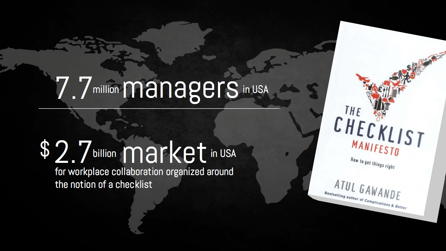
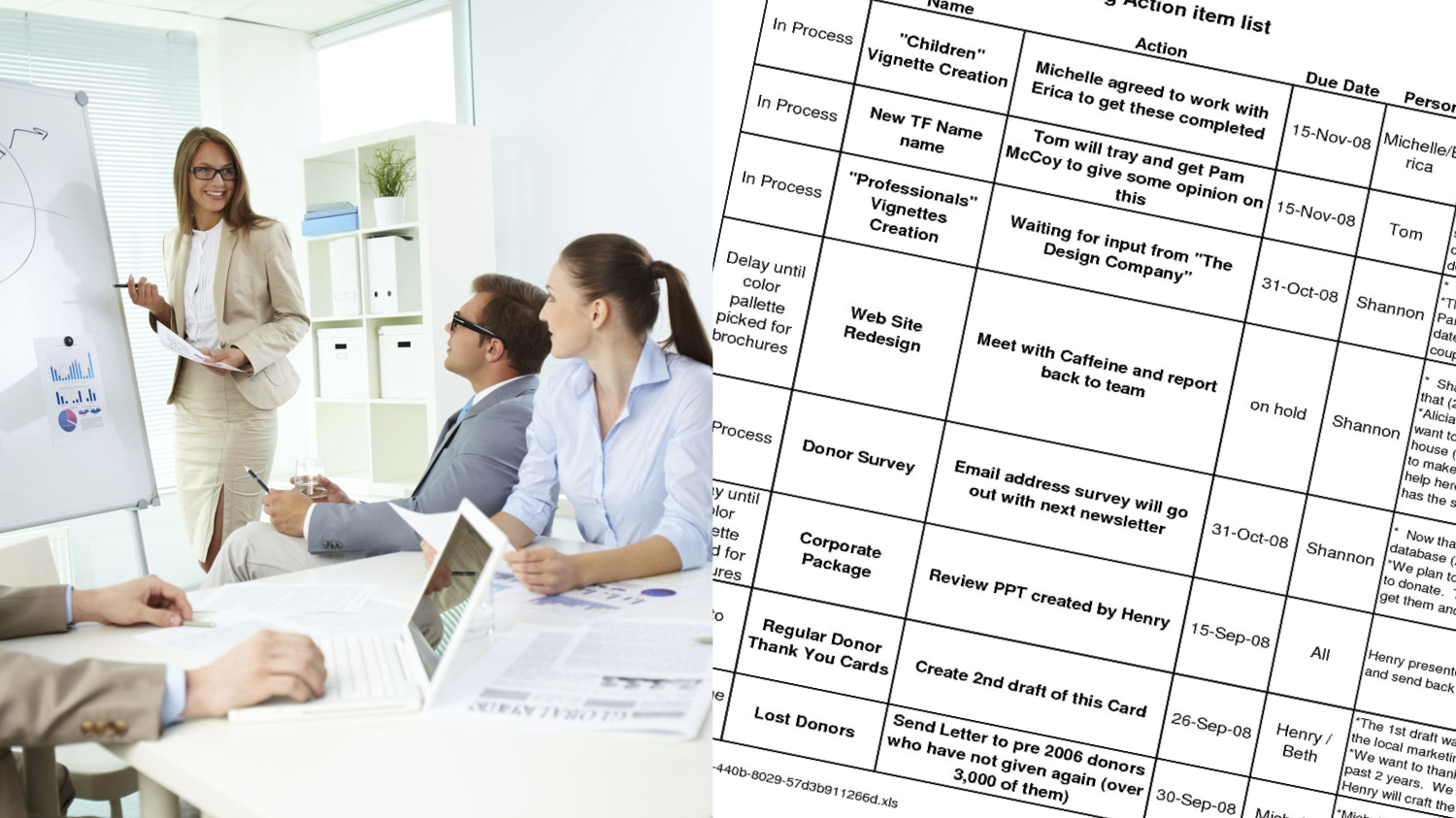
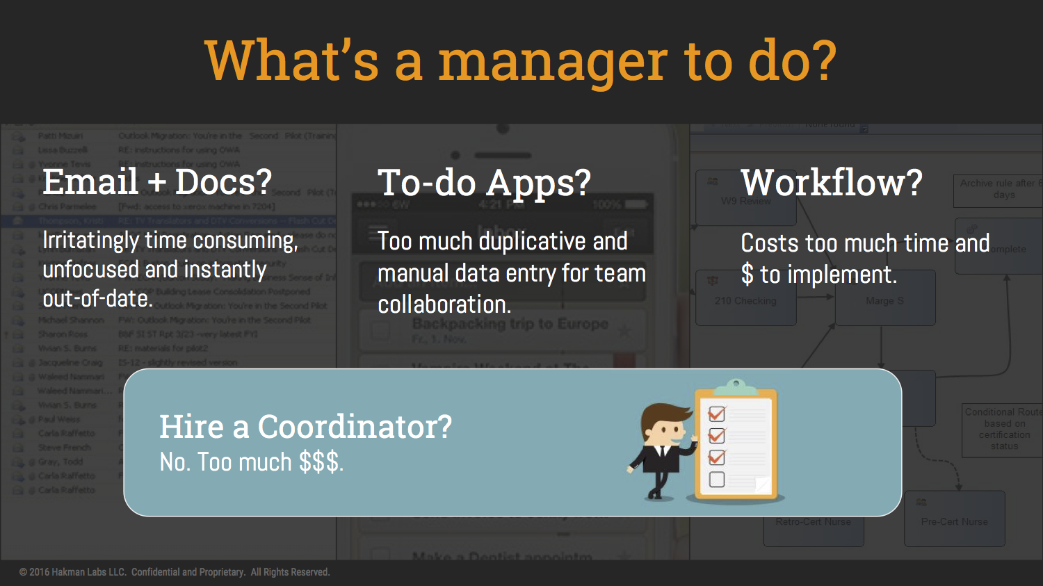
Assumption: every organization has operation processes that managers have difficulties managing them efficiently, even though these processes are essentially checklists of to-do items.
My missions
When the project kicks off, the team has a presumed solution to the problem: a checklist app for business. With that in mind, I have set multiple missions for myself:
Find out who is the target user
Verify the problem and solution
Shape the product vision
Provide direction to business goal
Create a meaningful and delightful design
A process with user centered methodologies
Interviews
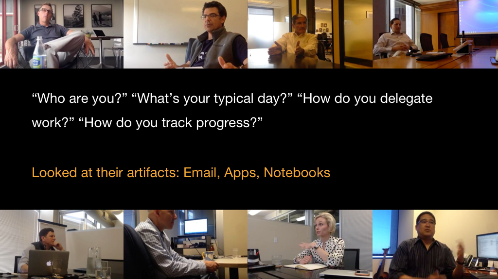
Interviewed 20+ managers and CEOs in small/medium businesses, semi-constructed in 3 parts:
Questions to get user profile
Contextual inquiry on current solutions
Validating assumptions through sketches
The direct feedback was positive. However, to me, that only means they do have the need, because they had tried apps that had 80% of what we were offering, and they didn’t like them. More importantly, after a few rounds of interviews, I started to identify patterns.
Competitive analysis
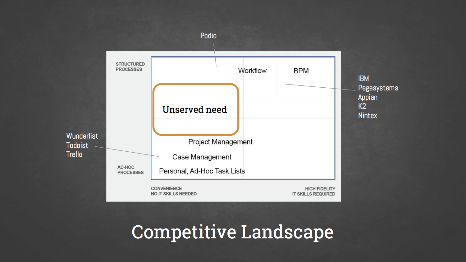
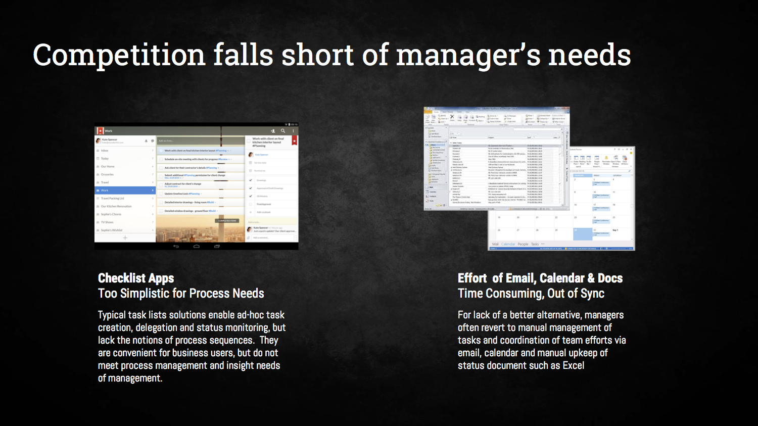
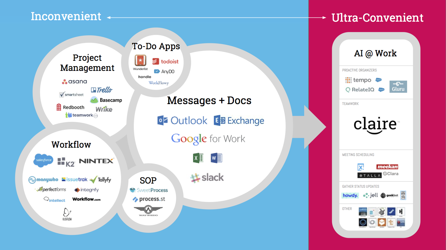
The managers have actually tried popular apps like Trello, Asana, Podio… These products have millions of registered users, but in fact they got abandoned after a couple of months use. One of the CEOs said, “it’s too much”. Asana last year had a major change in the user experience, shifting the focus from project management to lists of to-do items. That was a sign telling me that I am on a right track, but I need to go beyond that.
Identify patterns
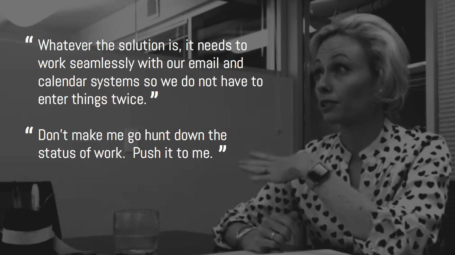
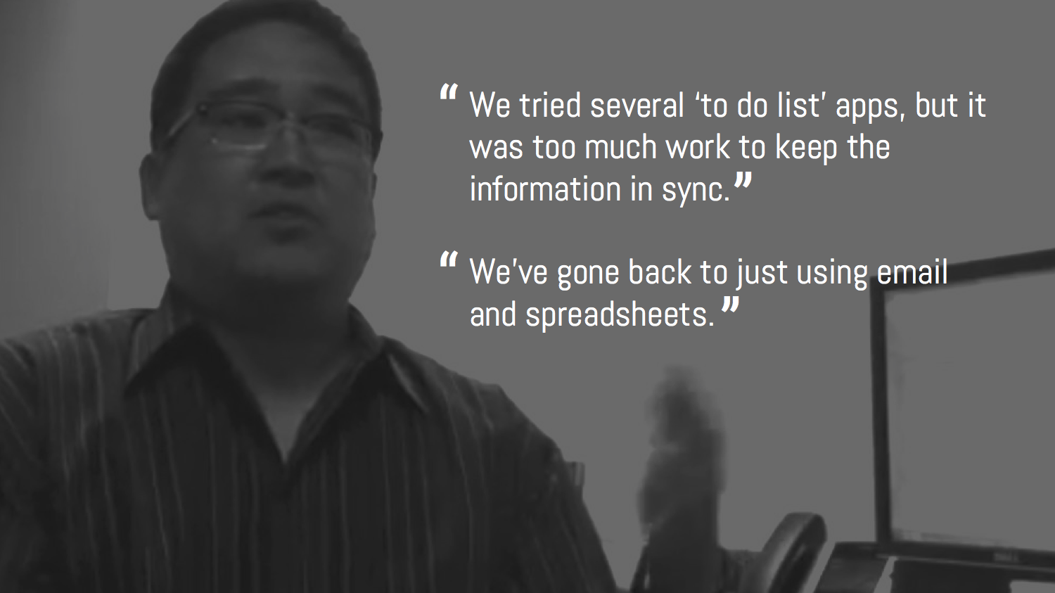
There were re-occuring patterns from the interviews, for example, 90% of them complained about entering the same information multiple times. They have many apps for work, which don’t synchronize smartly. And they spend time log-in log-out checking on all the work progress. While they’ve been trying, they keep going back to email and spreadsheets.
Insights and design considerations
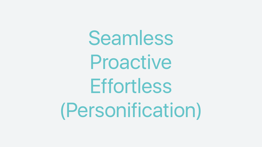
The design should be integrated seamlessly with whatever user is using at work, mostly email at the moment.
It needs to be smart enough to proactively interact with user.
The entering information multiple times is painful, the less manual work the better.
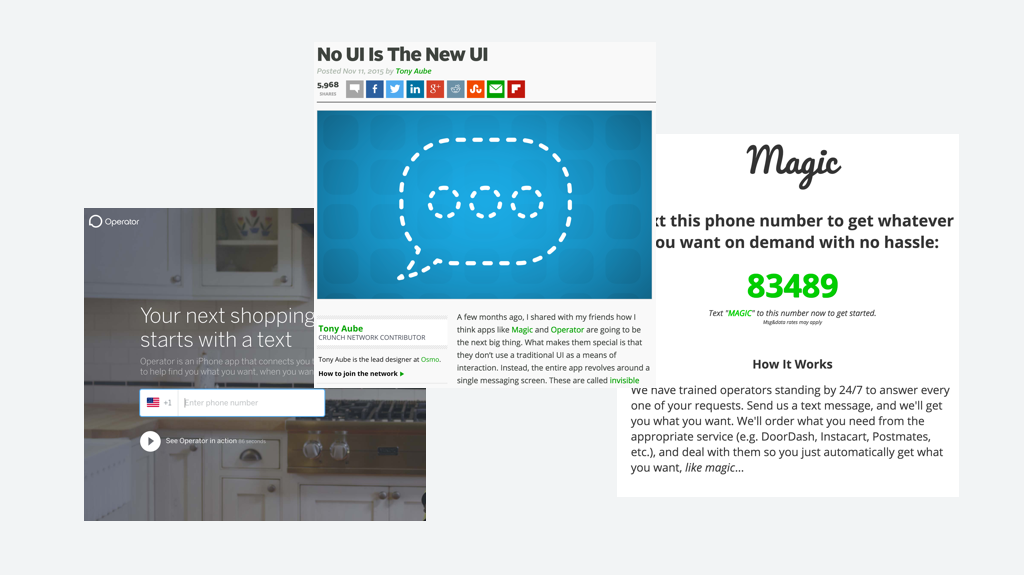
From all these, I got a thought that although we could go on and crank out more versions, even I made the simplest UI in the world, there is limitation, for instance, user has to login/logout. If the product addresses more user need in the future, more buttons are introduced, then it’s back to the old problem other apps are suffering. When “it’s too much”, user will go back to the old-school way. So it was time for a different approach, I started to think about No UI strategy.
Secondary research
While I did secondary researches on No UI experience, the topic of AI pops up.
More concept validation on No UI strategy
Design core and product vision
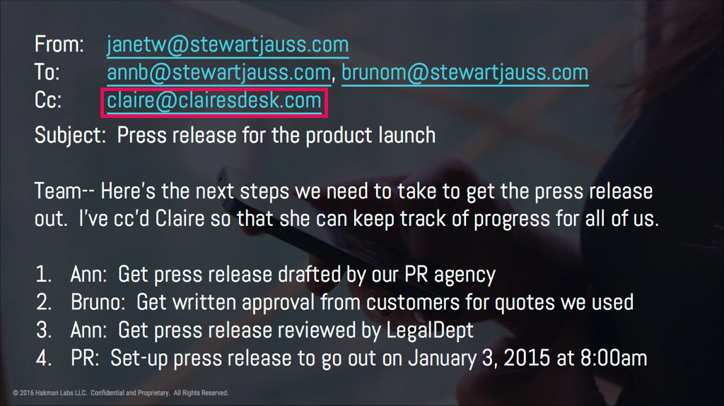
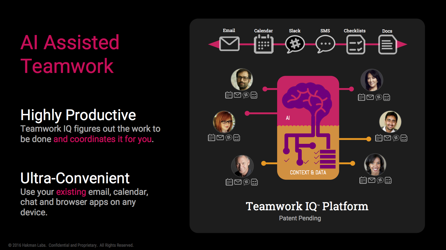
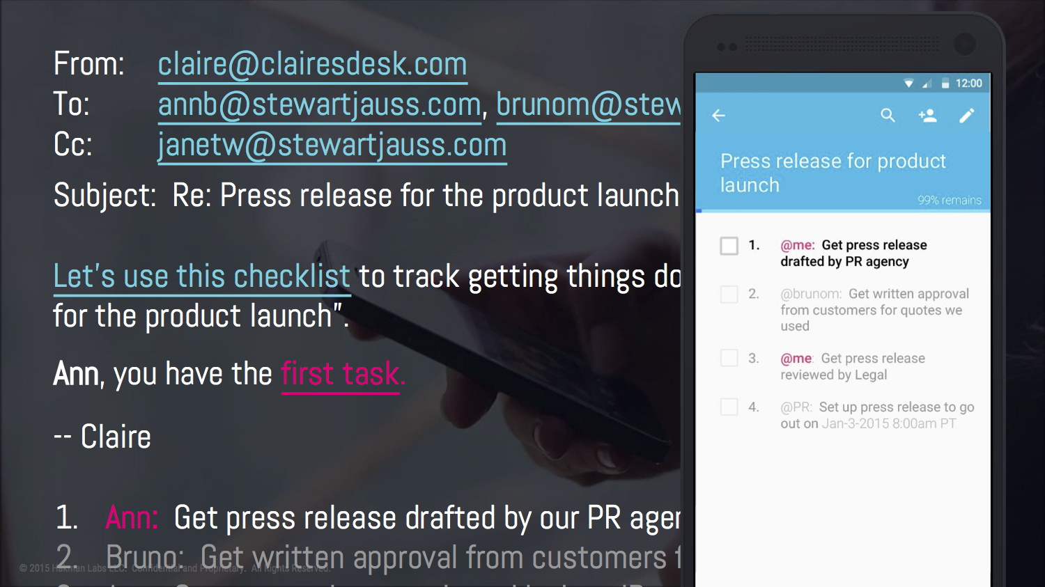
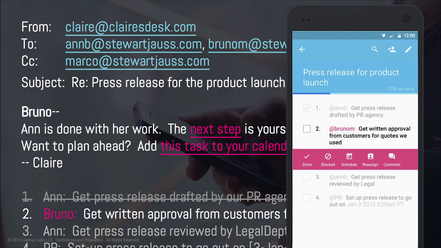
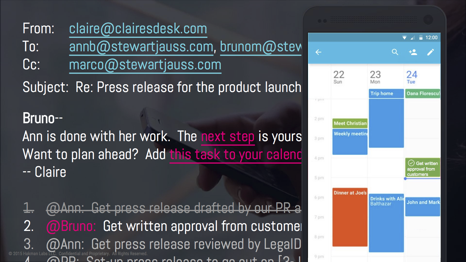
As a result, the current core of the design switches from a checklist app to an AI named Claire that lives in the Cc field in the email. The product vision becomes big in the integrating AI platform with all the services and apps business people are using.
Personas, journey map and touchpoints
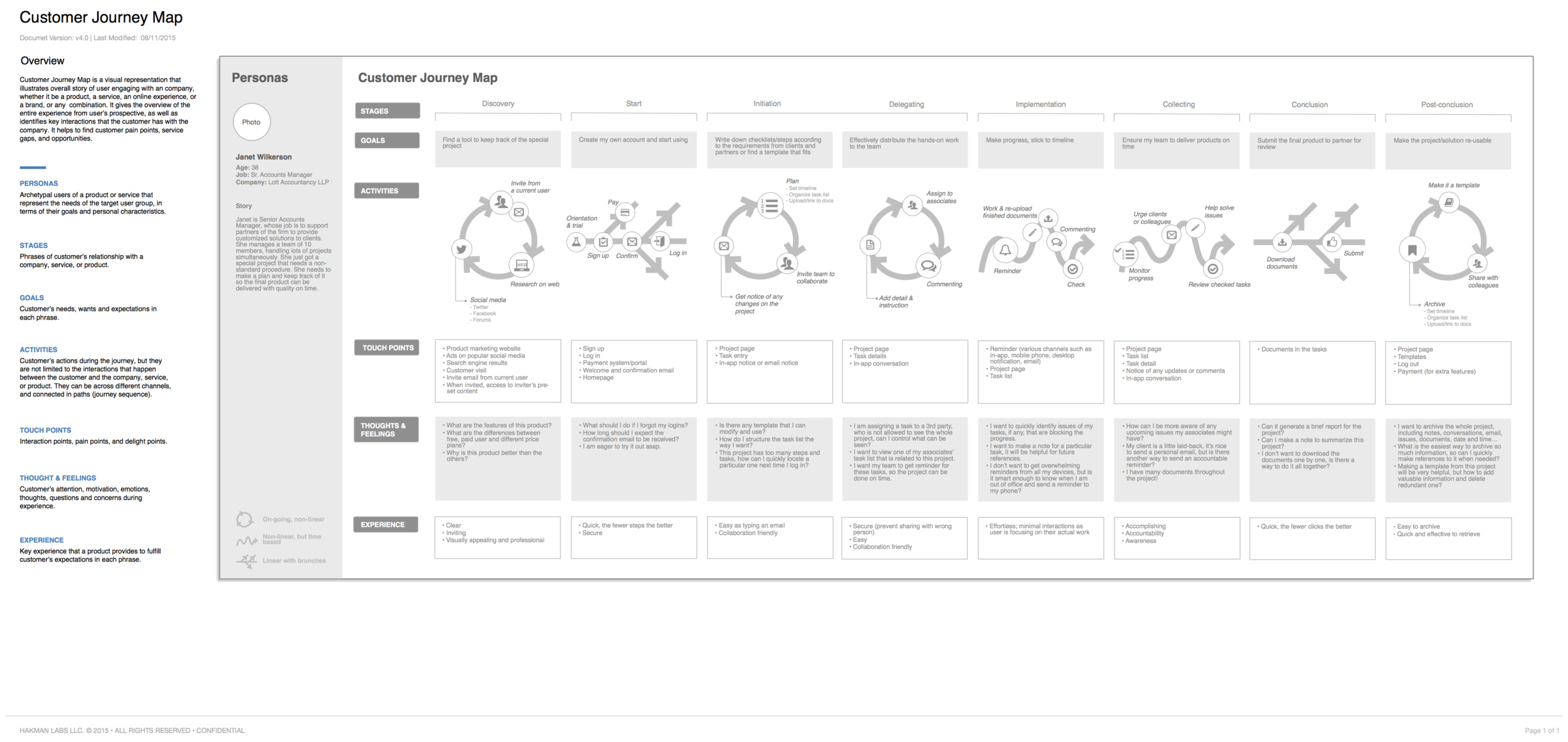
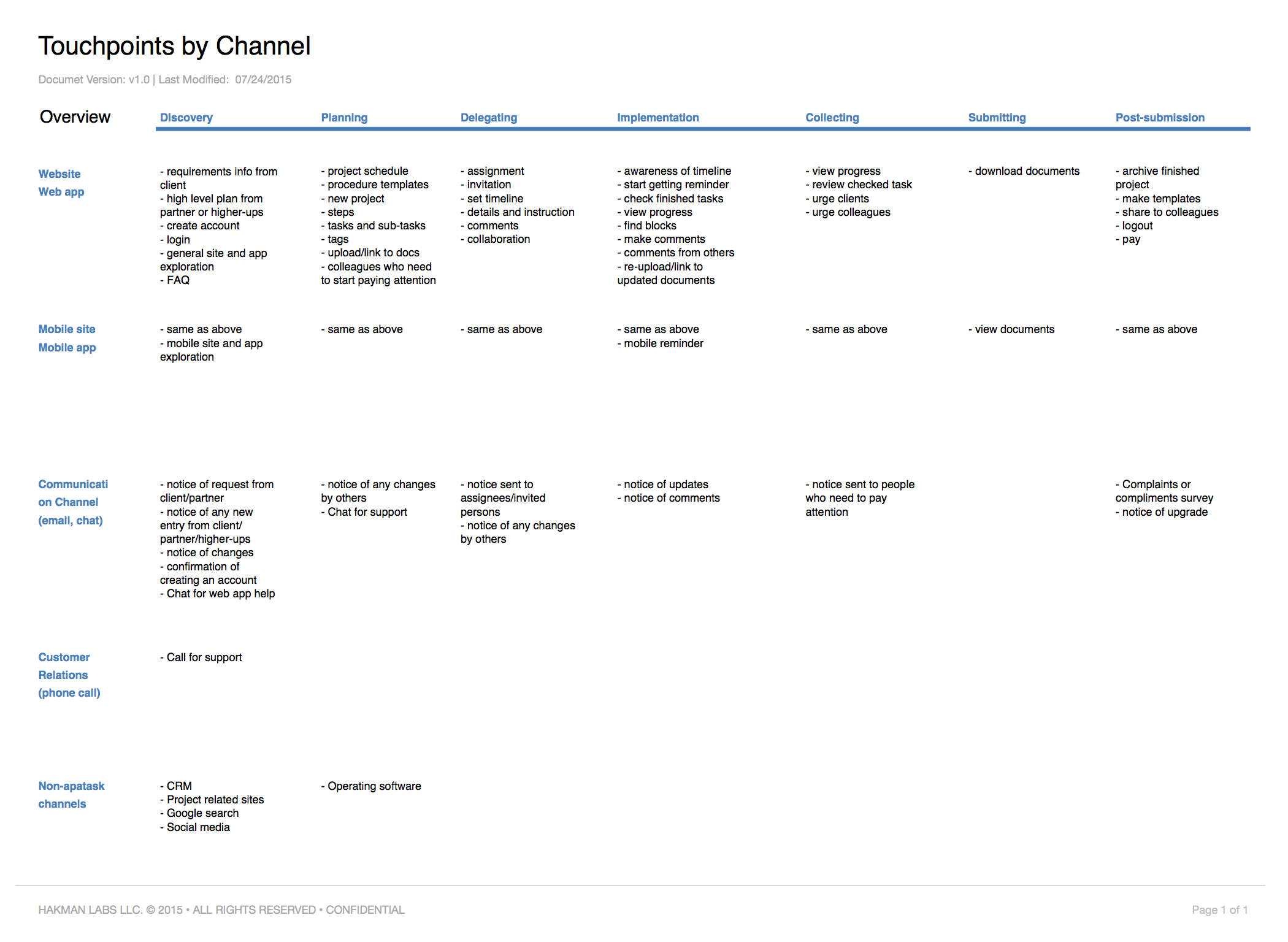
While the vision is big, the difficult part is going back to small when designing and implementing, because it’s just a beginning and a start-up has limited resources. In order to help planning the roadmap, I created four personas based on the interviews findings. Then I took the primary persona and her most typical use case to create a customer journey map. I identified user’s touch points in the journey. The whole team together listed out the related screens for these touch points, and prioritize them. Engineers estimated the difficulty and time they need to spend on each features, so that we planned out the roadmap for Alpha, Beta, MVP, Version 1.0.
Design Examples
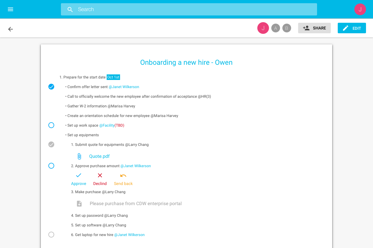
Google Material
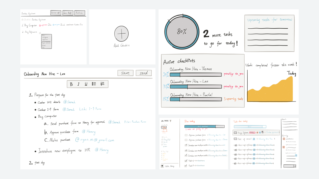
I used Material Design elements due to fast development, so to get tested asap. The checklist app is not abandoned, but became a supporting application. User can still go in and change things so that the AI gets trained.
Iterations
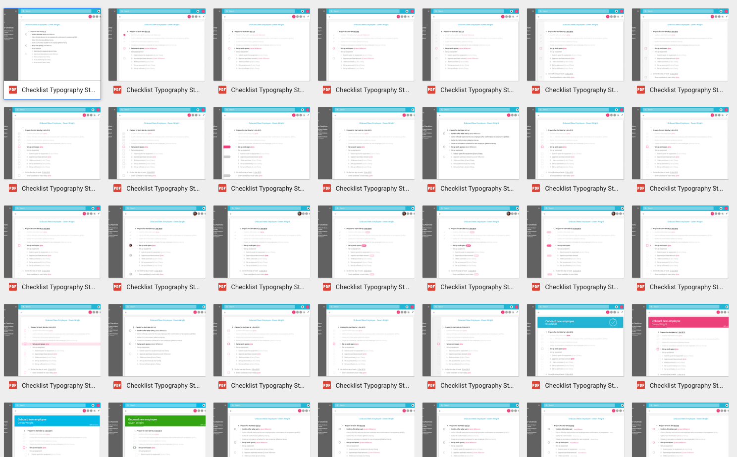
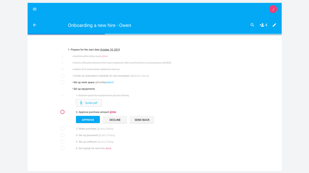
Although it’s based on Material design, it’s been through a lot iteration and exploration, especially on the typography because the application intended to be text heavy. I did simple testing with friends and see how fast they could find the information. The later version of design strips down to minimal. I used limited colors to only outstanding the needed information for the user in the given contexts.
Flows
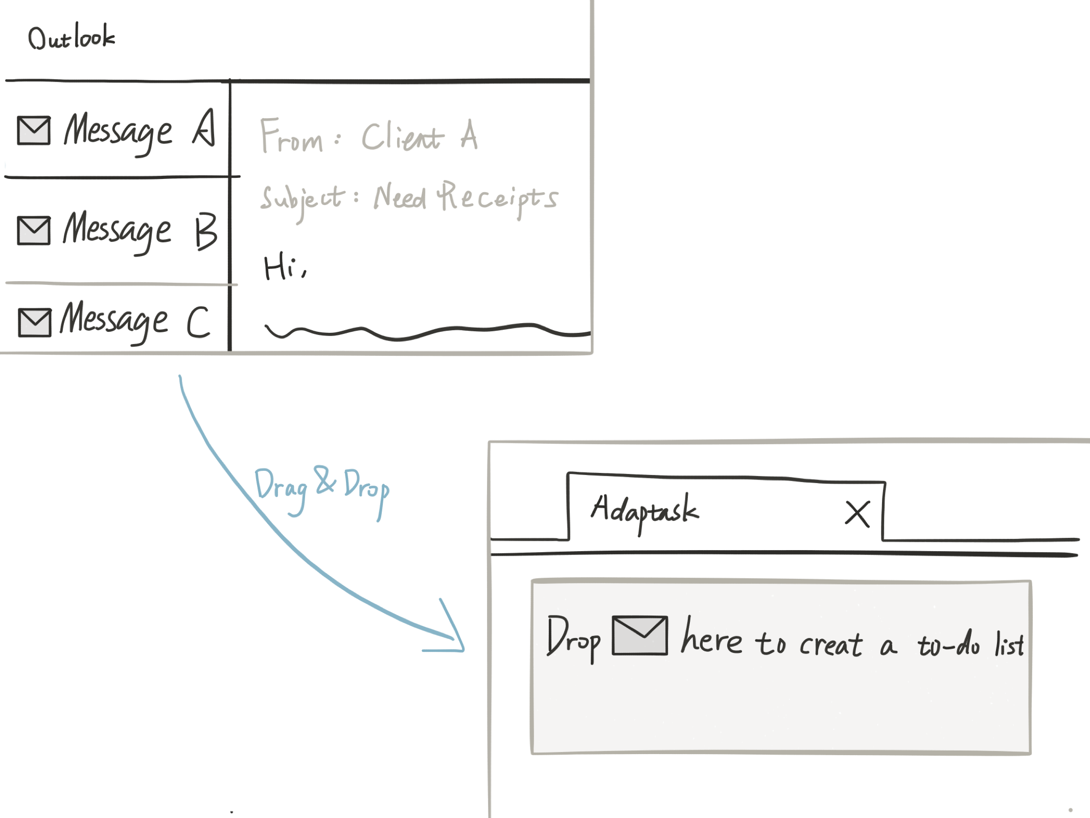
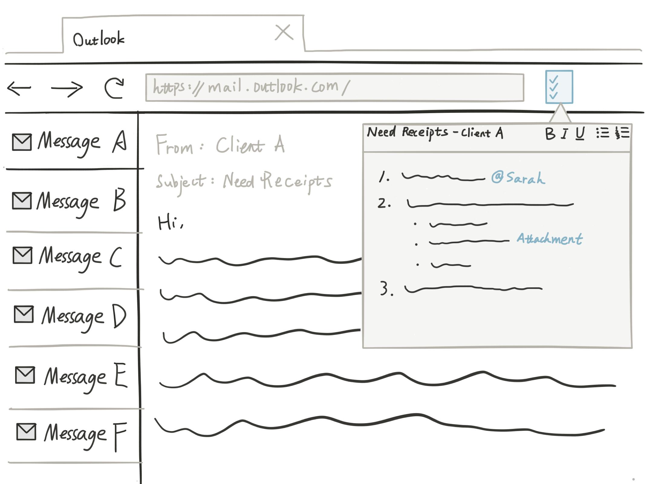
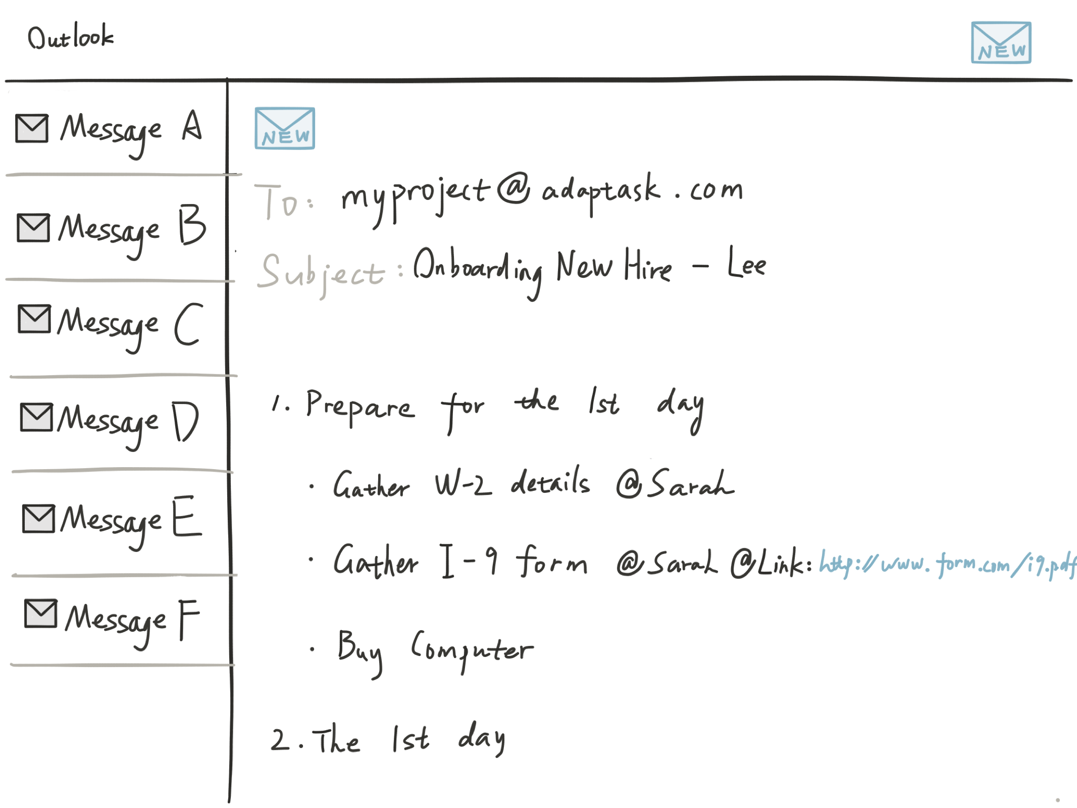
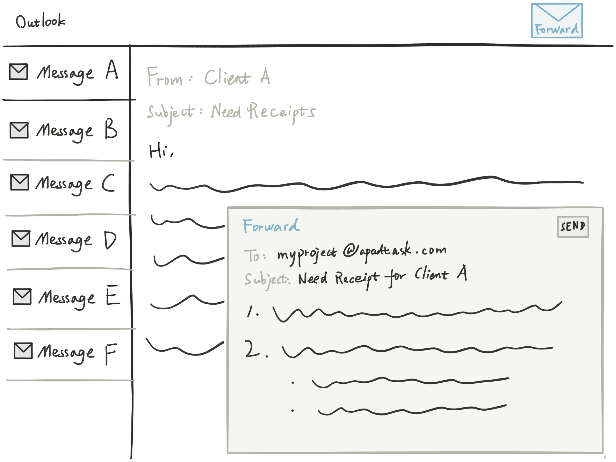
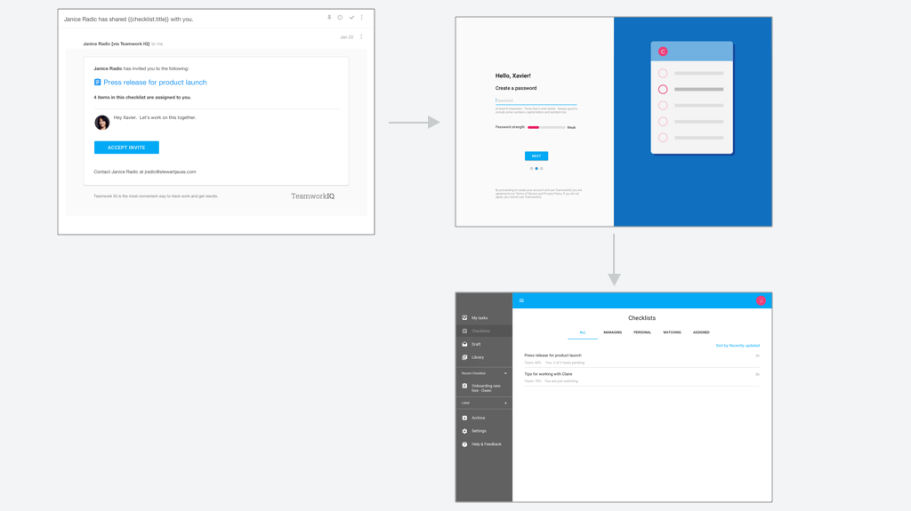
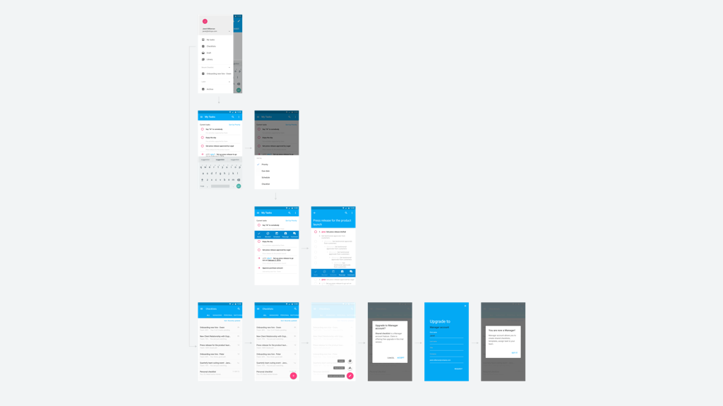
Meanwhile there are lots of flows that get developed, for example, onboarding a new user from getting an email to using the app. Or more complicated flow from managing list of checklists, to a single checklist and to a single task.
reflections
The product is close to private beta and I am planning for testing with users.
Through a year process of guiding a business to create a product from scratch that aims at providing meaningful and delightful experience to user, I have a lot of reflections, such as:
Embrace failure early.
A great design is about aligning business goal with user's goal.
Real insights come from meeting user in their natural context.
The better I understand the user, the more likely I am on the track of designing the right solution.
Early involvement of all the team members are crucial and insightful.
Making sure everyone on the same page is as important as expanding my imagination and creativity.
Vision grows big easily and design never ends, but being practical in small is more challenging.
